---
title: "Manhattan Plots"
output:
rmarkdown::html_vignette:
toc: true
description: >
Visualize a summary of the association between cluster-feature and feature-feature relationships.
vignette: >
%\VignetteIndexEntry{Manhattan Plots}
%\VignetteEngine{knitr::rmarkdown}
%\VignetteEncoding{UTF-8}
---
```{r setup, include=FALSE}
knitr::opts_chunk$set(echo = TRUE)
```
```{r echo = FALSE}
options(crayon.enabled = FALSE, cli.num_colors = 0)
```
Download a copy of the vignette to follow along here: [manhattan_plots.Rmd](https://raw.githubusercontent.com/BRANCHlab/metasnf/main/vignettes/manhattan_plots.Rmd)
Manhattan plots can be quickly visualize the relationships between features and cluster solutions.
There are three main Manhattan plot variations provided in metasnf.
1. `esm_manhattan_plot` Visualize how a set of cluster solutions separate over input/out-of-model features
2. `mc_manhattan_plot` Visualize how representative solutions from defined meta clusters separate over input/out-of-model features
3. `var_manhattan_plot` Visualize how one raw feature associates with other raw features (similar to `assoc_pval_heatmap`)
## Data set-up
The example below is taken from the ["complete example" vignette](https://branchlab.github.io/metasnf/articles/a_complete_example.html).
```{r eval = FALSE}
library(metasnf)
# Start by making a data list containing all our data frames to more easily
# identify observations without missing data
full_dl <- data_list(
list(subc_v, "subcortical_volume", "neuroimaging", "continuous"),
list(income, "household_income", "demographics", "continuous"),
list(pubertal, "pubertal_status", "demographics", "continuous"),
list(anxiety, "anxiety", "behaviour", "ordinal"),
list(depress, "depressed", "behaviour", "ordinal"),
uid = "unique_id"
)
# Partition into a data and target list (optional)
dl <- full_dl[1:3]
target_dl <- full_dl[4:5]
# Build space of settings to cluster over
set.seed(42)
sc <- snf_config(
dl = dl,
n_solutions = 20,
min_k = 20,
max_k = 50
)
# Clustering
sol_df <- batch_snf(dl, sc)
# Calculate p-values between cluster solutions and features
ext_sol_df <- extend_solutions(
sol_df,
dl = dl,
target = target_dl,
min_pval = 1e-10 # p-values below 1e-10 will be thresholded to 1e-10
)
```
## Associations with Multiple Cluster Solutions (`esm_manhattan_plot`)
```{r eval = FALSE}
esm_manhattan <- esm_manhattan_plot(
ext_sol_df[1:5, ],
neg_log_pval_thresh = 5,
threshold = 0.05,
point_size = 3,
jitter_width = 0.1,
jitter_height = 0.1,
plot_title = "Feature-Solution Associations",
text_size = 14,
bonferroni_line = TRUE
)
```
```{r eval = FALSE, echo = FALSE}
ggplot2::ggsave(
"vignettes/esm_manhattan.png",
esm_manhattan,
height = 5,
width = 8,
dpi = 100
)
```
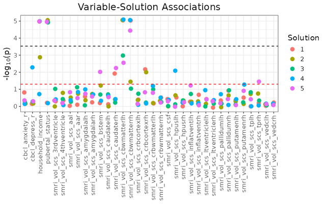
A bit of an unwieldy plot if you try looking at too many solutions at a time, but it can be handy if you intend on just examining a few cluster solutions.
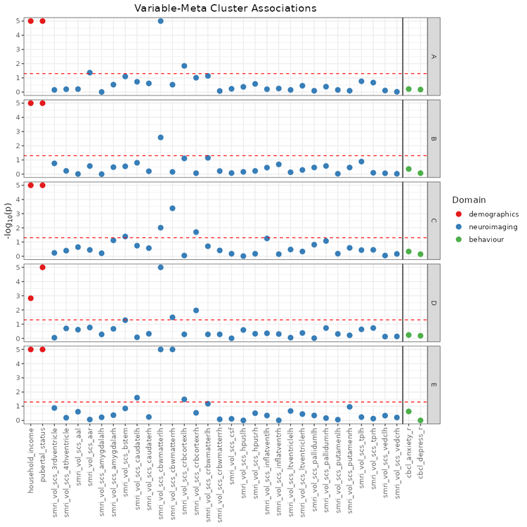
## Associations with Meta Clusters (`mc_manhattan_plot`)
The `mc_manhattan_plot` function can be used after meta clustering to more efficiently examine the entire space of generated cluster solutions.
```{r eval = FALSE}
# Calculate pairwise similarities between cluster solutions
sol_aris <- calc_aris(sol_df)
# Extract hierarchical clustering order of the cluster solutions
meta_cluster_order <- get_matrix_order(sol_aris)
# Create a base heatmap for visual meta clustering
ari_hm <- meta_cluster_heatmap(
sol_aris,
order = meta_cluster_order
)
# Identify meta cluster boundaries
# This can also be by trial & error if you do not wish to use the shiny app.
shiny_annotator(ari_hm)
# Result of meta cluster examination
split_vec <- c(2, 5, 12, 16)
# Create a base heatmap for visual meta clustering
ari_hm <- meta_cluster_heatmap(
sol_aris,
order = meta_cluster_order,
split_vector = split_vec
)
ari_hm
# Label meta clusters based on the split vector
mc_sol_df <- label_meta_clusters(
sol_df = ext_sol_df,
split_vector = split_vec,
order = meta_cluster_order
)
# Extracting representative solutions from each defined meta cluster
rep_solutions <- get_representative_solutions(sol_aris, mc_sol_df)
mc_manhattan <- mc_manhattan_plot(
rep_solutions,
dl = dl,
target_dl = target_dl,
point_size = 3,
text_size = 12,
plot_title = "Feature-Meta Cluster Associations",
threshold = 0.05,
neg_log_pval_thresh = 5
)
```
```{r eval = FALSE, echo = FALSE}
ggplot2::ggsave(
"vignettes/mc_manhattan_clean.png",
mc_manhattan,
height = 10,
width = 10,
dpi = 100
)
```
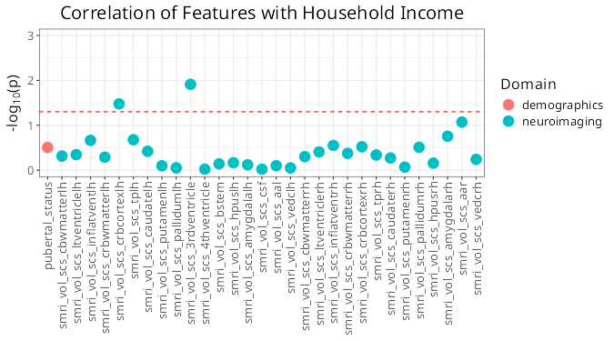
## Associations with a Key Feature
You can also visualize associations with a specific feature of interest rather than cluster solutions.
The only thing needed for this plot is a data_list - no clustering necessary.
```{r eval = FALSE}
var_manhattan <- var_manhattan_plot(
dl,
key_var = "household_income",
plot_title = "Correlation of Features with Household Income",
text_size = 16,
neg_log_pval_thresh = 3,
threshold = 0.05
)
```
```{r eval = FALSE, echo = FALSE}
ggplot2::ggsave(
"vignettes/var_manhattan.png",
var_manhattan,
height = 5,
width = 9,
dpi = 75
)
```